🌷 Personal Project: Rebrand Taipei CKS Shilin Residence Tulip Festival.
🌷 Tools: Adobe Illustrator, Adobe Photoshop, Figma
🌷 This page highlights my expertise in rebranding campaigns.
🌷 Brand Story 🌷
Surrounded by majestic mountains and meandering rivers Taipei, a city where flowers bloom all year round, brings forth a vibrant spectacle. From every corner of the city. The flowers of Taipei welcome you. Join the celebration and revel in the city’s floral tapestry. Discover the blossoming charm of Flowers in Taipei. (Flowers In Taipei, 2025)
🌷 Design Idea 🌷
I came from Taipei, a city I've called home for over three decades. To me, Taipei is more than just a place - it's a living story, nestled among mountains like a secret place on the earth. Taiwan itself is cradled by the sea, an island wrapped in waves and wonder. Taipei is a red ruby glowing in a sea of blue, a spark where memories are born and treasures of excitement wait to be found.
🌷 Research 🌷
The original design brief:
(1) Golden ratio in nature: The golden ratio in nature can be seen in every leaf and petal, which grows in a meticulously crafted manner. Conceptualized with the concept of the golden ratio, our logo is composed of alternatively-arranged circles of different sizes, presenting a complex layering of geometric optical illusions, which provides a kaleidoscopic experience for visitors to appreciate the flower season from unique perspectives.
(2) 12 Flower Seasons: Taipei, a City Surrounded by Mountains and Rivers. Located in the central hinterland of Taipei Basin, surrounded by five main mountain ranges such as Datun and Nangang Mountain Range, with Tamsui River, Keelung River, Dahan River, and Xindian River flowing through, Taipei is a city enriched by abundant natural beauty. In the intersection between circles of the logo lie 12 petals, representing Taipei’s 12 iconic flower seasons, which take turns to paint the city with a kaleidoscope of colors.
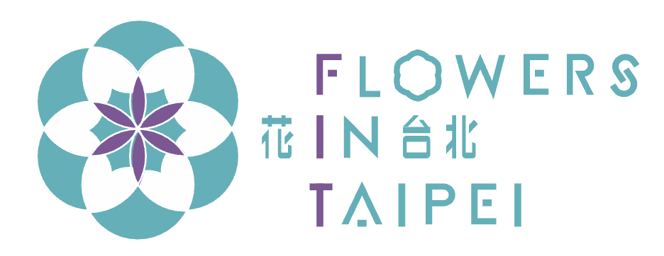
🌷 Rebranded logo🌷
I communicate with simplicity, a sense of happiness, and a clear, straightforward approach.
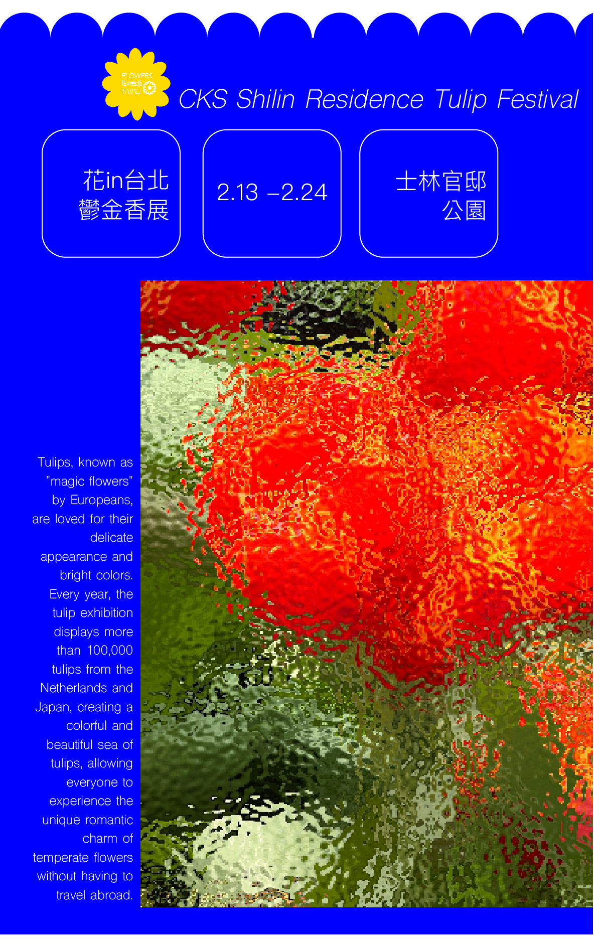
🌷 Poster Design 🌷
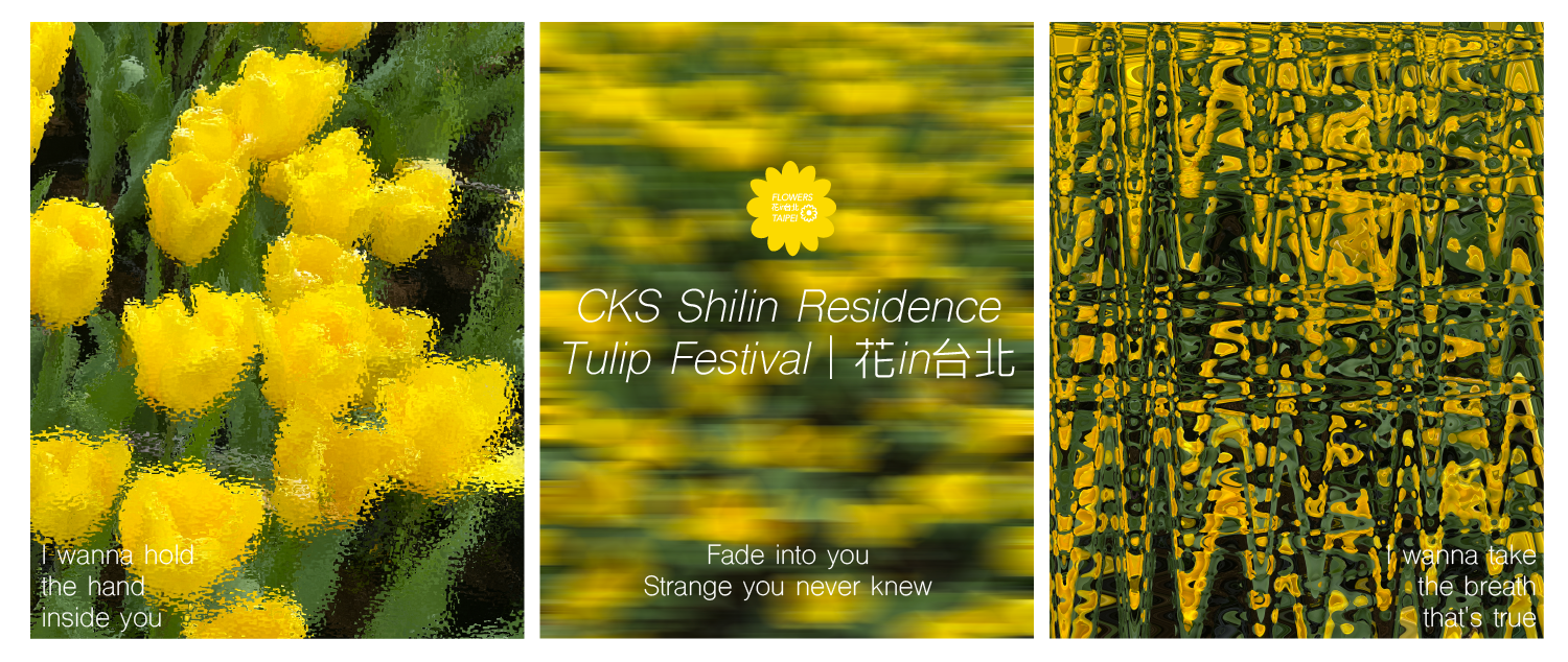
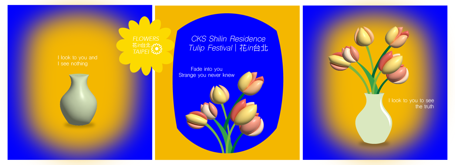
A striking blue background paired with a petal-edged poster design, featuring an image enhanced with a ripple effect to create an elegant and artsy aesthetic.
🌷 Online Banner Design 🌷
From Adobe Photoshop to Illustrator, art reveals itself in countless forms—each stirring a unique emotion and weaving its enchantment. In this project, I explored two distinct approaches to banner design: one using photography to evoke a poetic atmosphere, and the other employing illustration with a 3D effect to create visual depth and dimension.
🌷 Mobile App Design 🌷
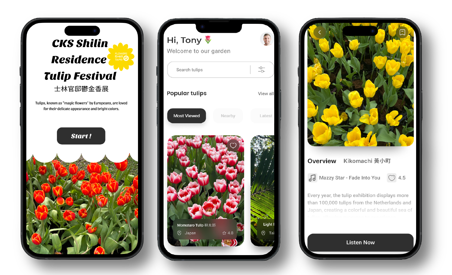
The city government made a website especially for the event, and I also created an app for the event. Using Figma, I designed a tourist app that showcases the story behind each tulip and recommends a song to enhance the floral experience.
🌷 Marketing Short Video 🌷
While planning to create a short video, I realized that the "preview" button in my editing software essentially produces a quick version of the final video. This simple concept actually aligns with the idea behind the marketing material—it's a way to convey the message clearly and efficiently. It also ties in nicely with the logo.
🌷 Conclusion 🌷
Regarding this rebranding project, the logo I designed is perhaps simpler than the original — but intentionally so. I believe the marketing for Flower In Taipei doesn't need to be complex, as it's an event meant to be welcoming and family-friendly, with a broad appeal to younger audiences as well. My goal was to create something clear, accessible, and inviting. Of course, there's still plenty of room for growth — especially since I didn’t receive any external feedback. That said, this process taught me a lot, particularly about the value of creating immersive experiences. Marketing shouldn’t just be one-directional; it should engage the audience on multiple levels—visually, emotionally, and even through touch and scent, when possible. That’s what I hope to keep building toward.
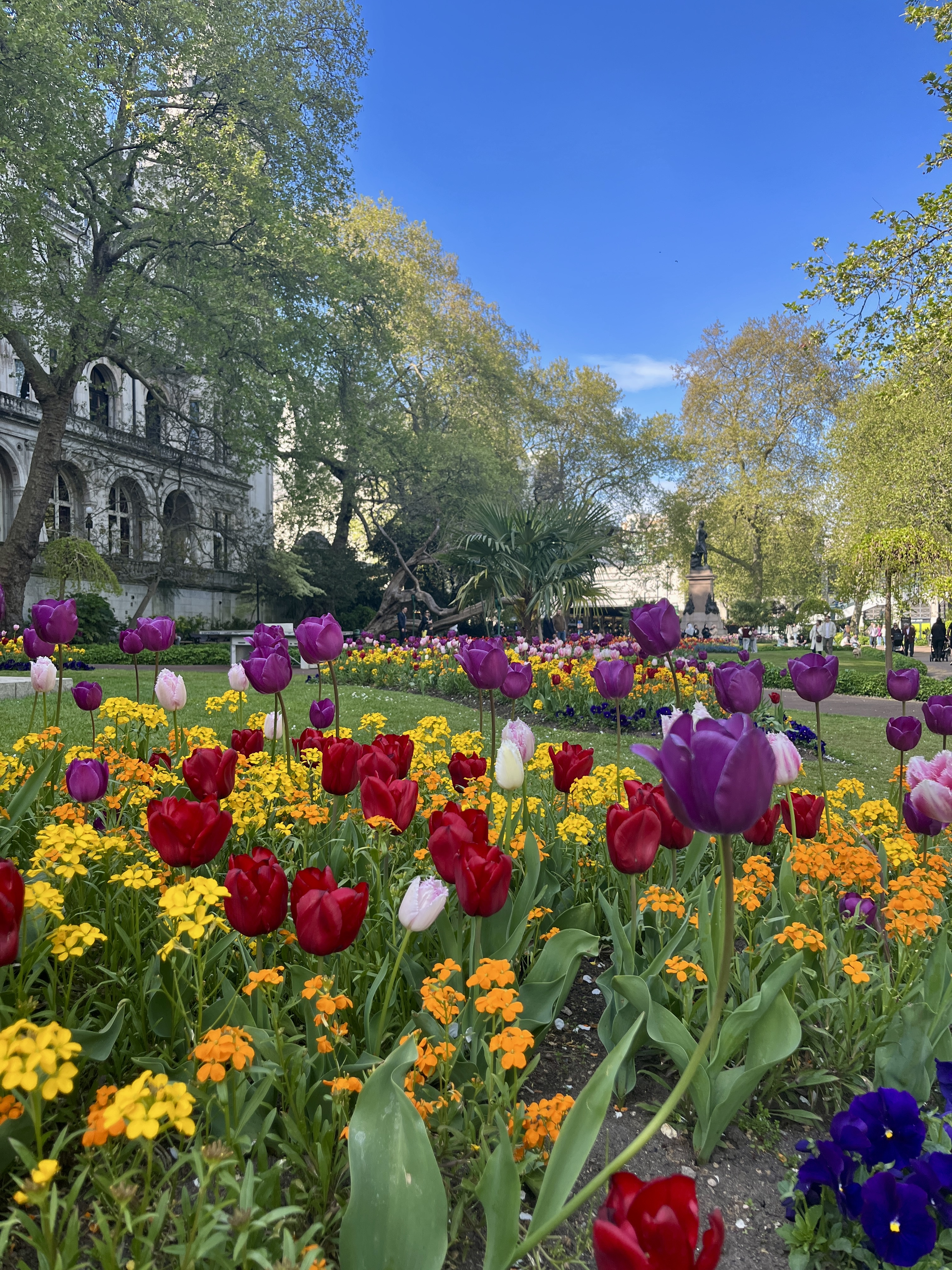
Tulip photo (just wanted to share :P)