🧂🍜 Identity Design Project: Creating hand-drawn food illustrations, menu designs, and packaging concepts, delivering a complete brand identity for a restaurant.
🧂🍜 Tools: Adobe Illustrator, Adobe Photoshop, Premiere Pro, Procreate
🧂🍜 This page showcases my brand design and visual communication expertise.
🧂🍜 Brand Story 🍋🍮
"As I walked through the quaint, Japanese-style streets of Beitou, Taipei, a familiar warmth returned—memories of childhood, when even the simplest food brought so much joy."
Sauce In My Fridge was born from that feeling—those small, comforting moments after school, when we’d come home to the aroma of something hot and homemade waiting on the table. Our mothers, always a step ahead, made sure we were never hungry.
That same warmth is what we want to share with every guest who walks through our doors after a long day. Whether you’ve been at work or just need a comforting bite, our food is here to remind you of that quiet happiness—simple, quick, and made with care.
At Sauce In My Fridge, we serve fast meals that feel like home. Nothing fancy—just hearty, satisfying food that hits the spot. Everyone’s welcome to come by and relive those little moments of joy.
🧂🍜 Thinking Process 🍋🍮
Woody colors are often associated with Japanese architecture because most Japanese buildings were originally simply built with wood. Because the restaurant aims to be simple and happy, I think the menu can best express the approachable presentation of food by drawing it, just like the feeling of a handwritten card rather than a printed card. The warmth that can be felt from the words is different.
🧂🍜 Colour Chosen 🍋🍮
🧂🍜 Logo Design 🍋🍮
I decided to use soy sauce as the logo.

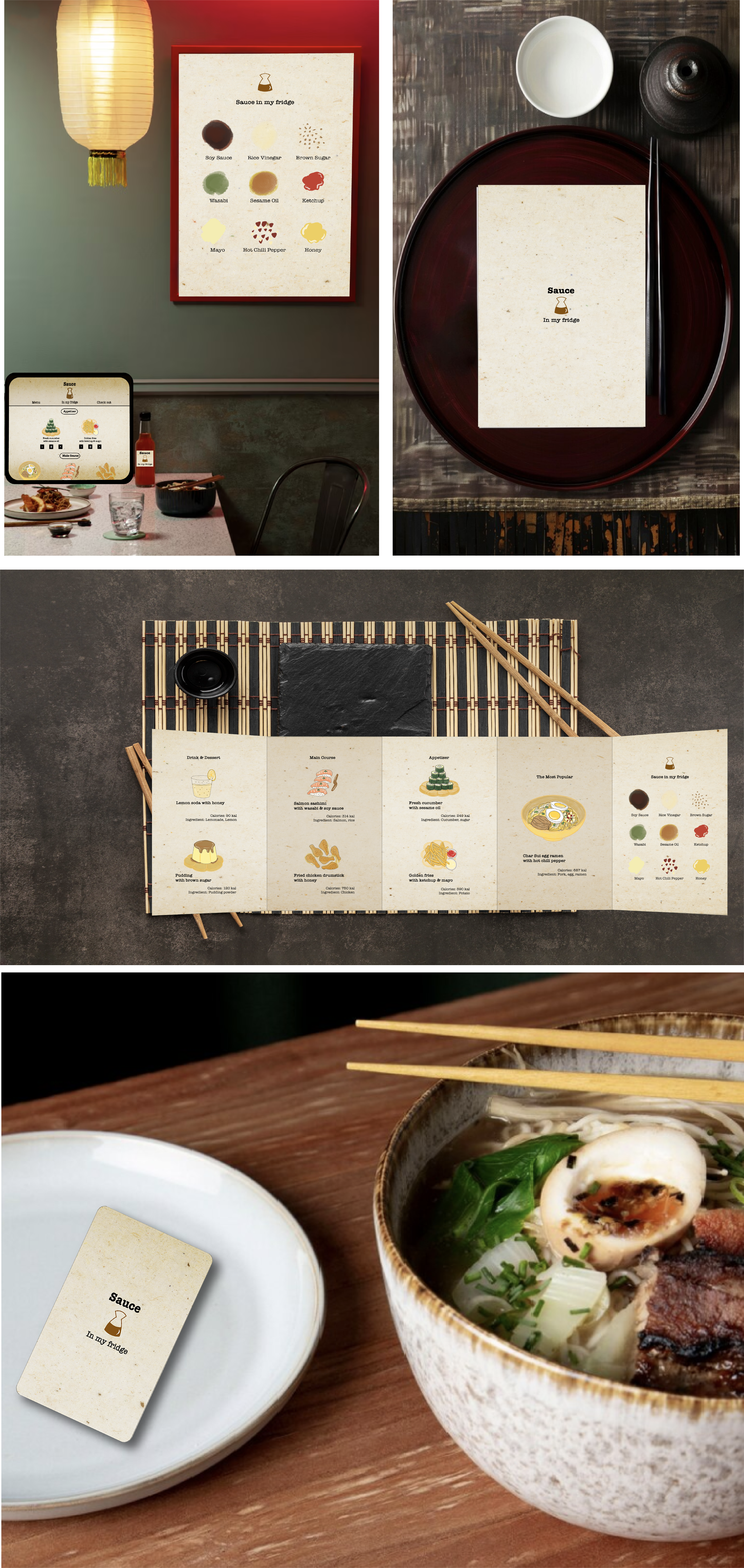
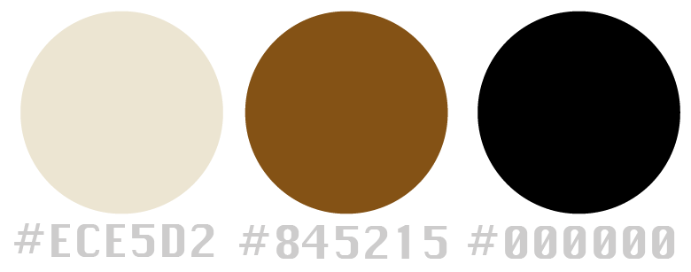
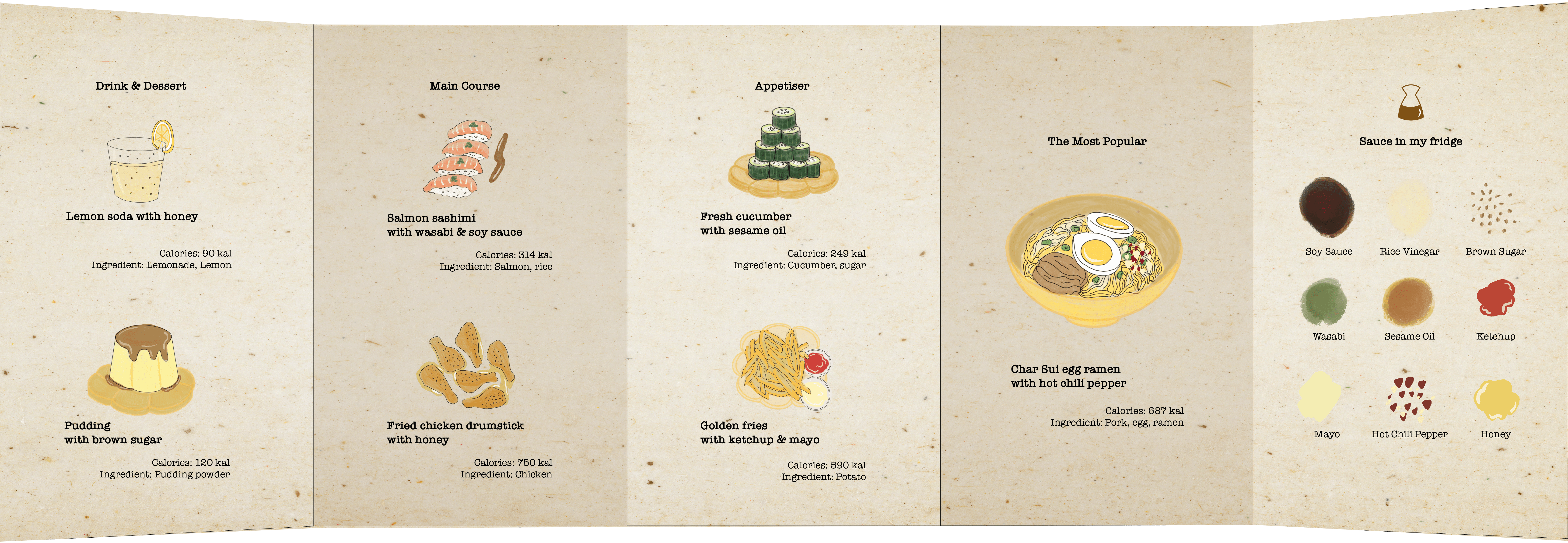
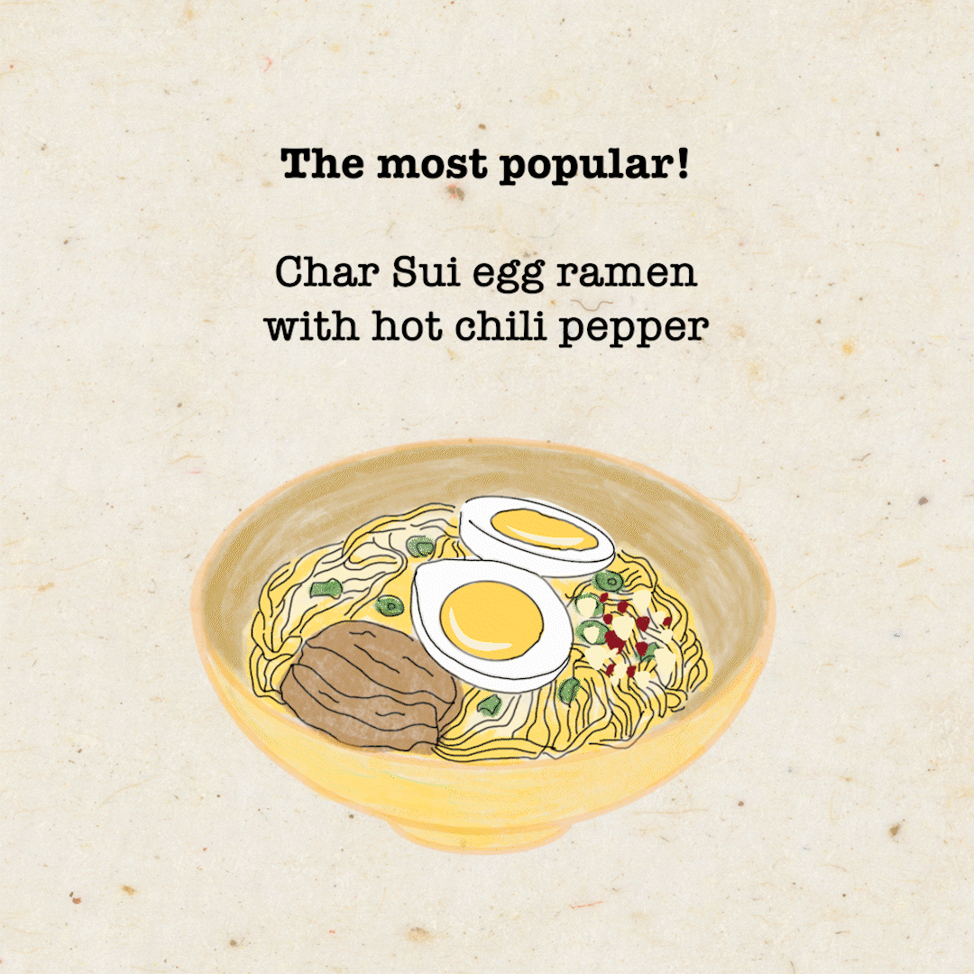
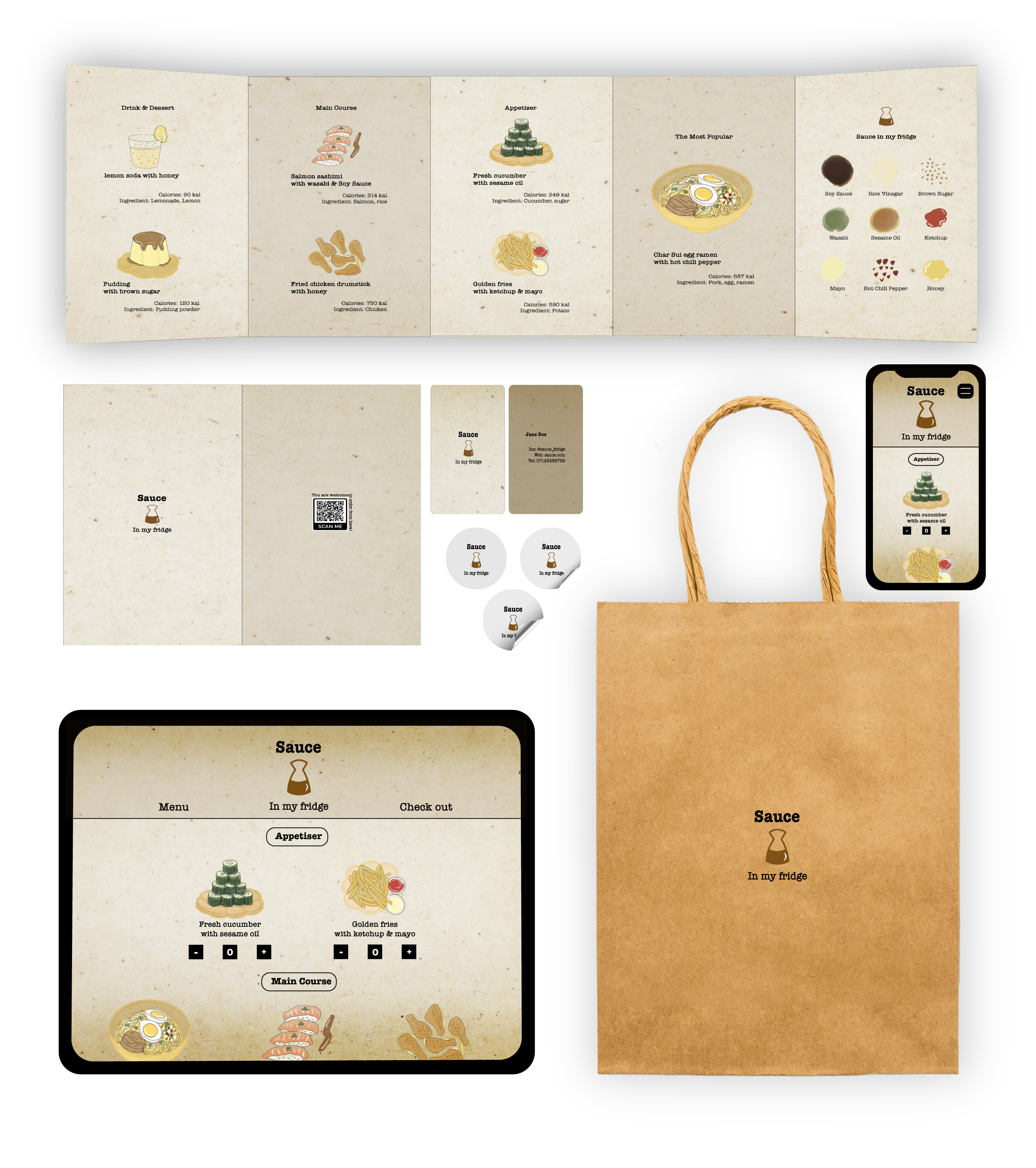
🧂🍜 Menu Design 🍋🍮
Experimenting with new dishes using the sauces in my fridge.
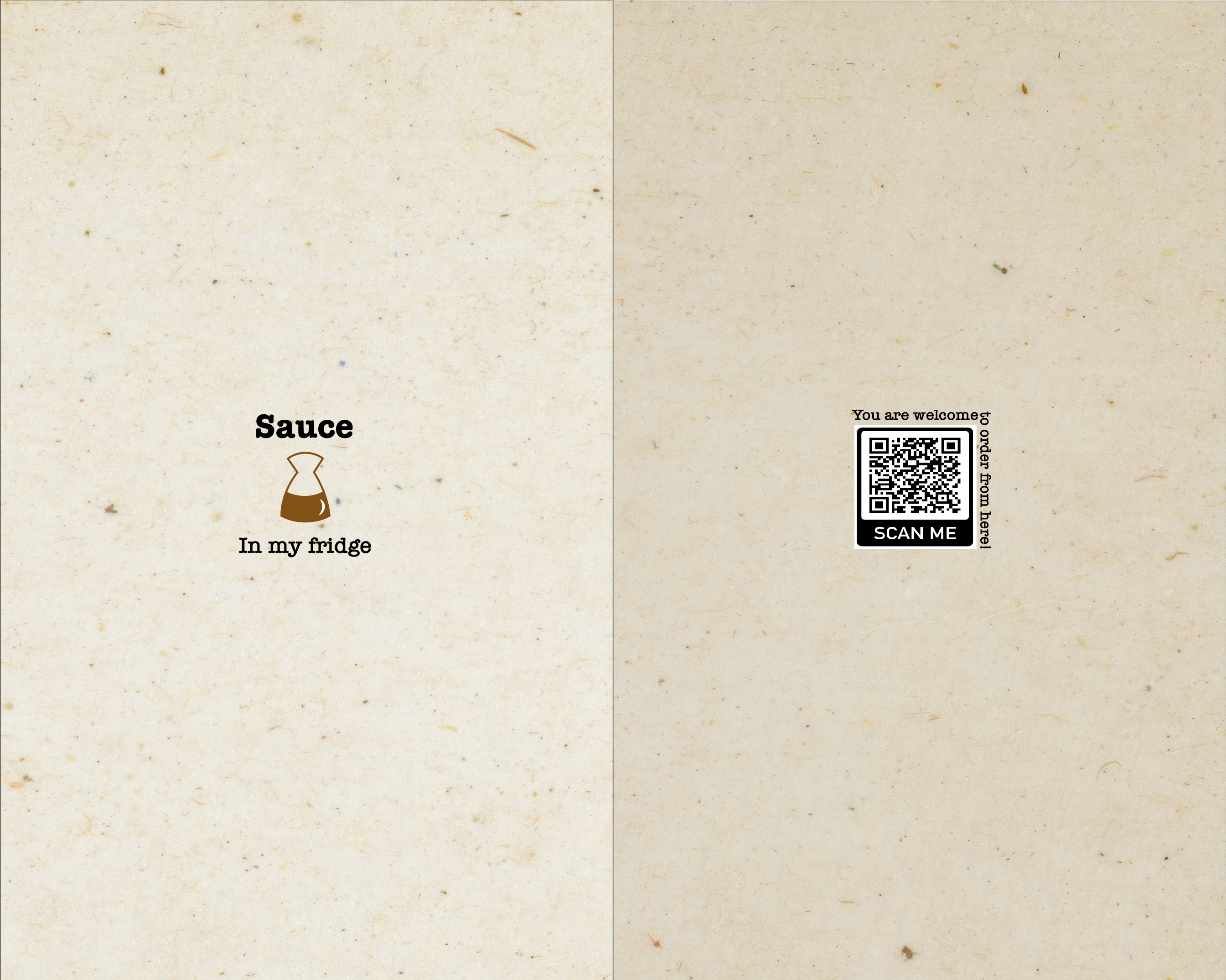
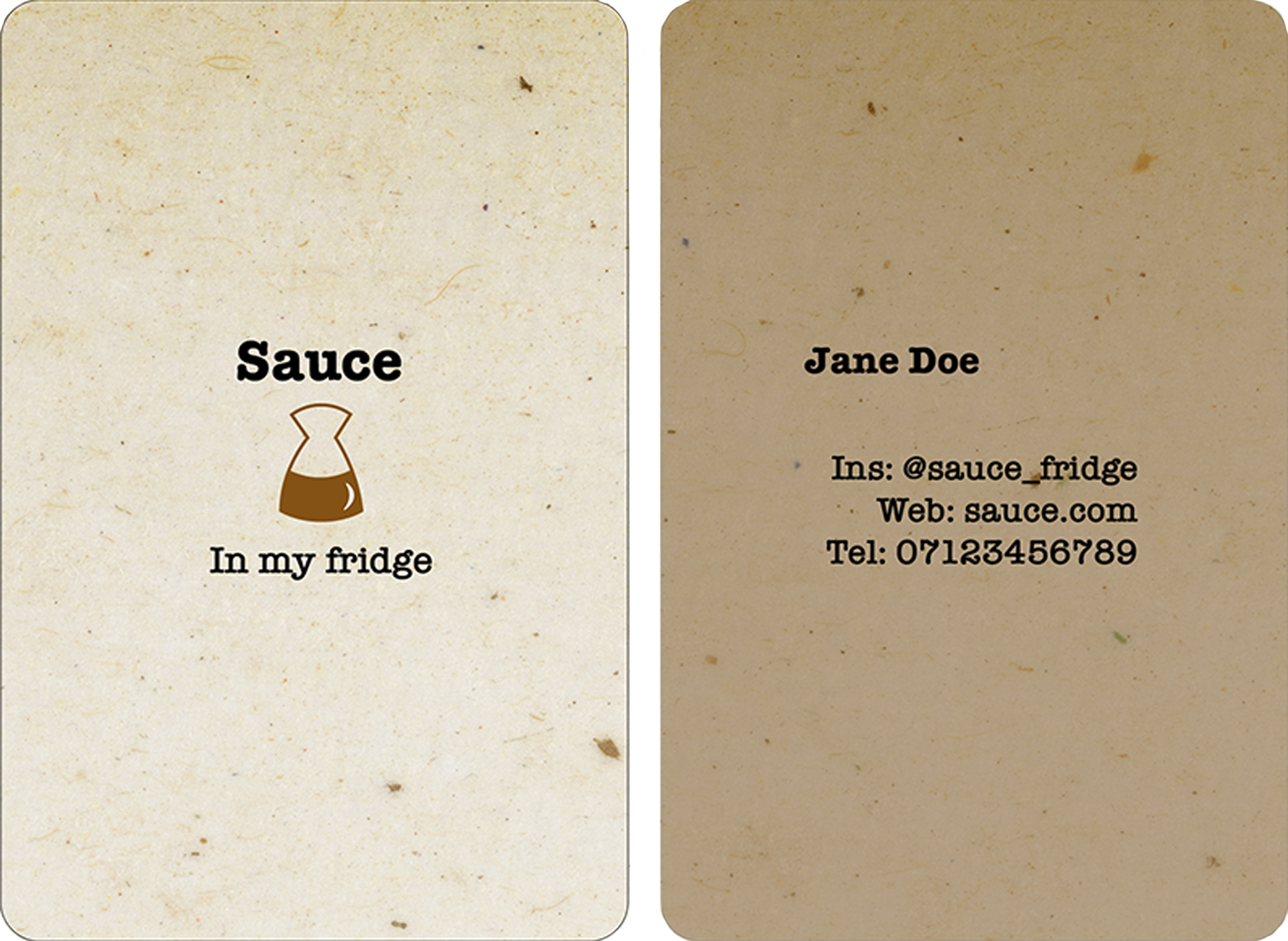
🧂🍜 Name card Design 🍋🍮
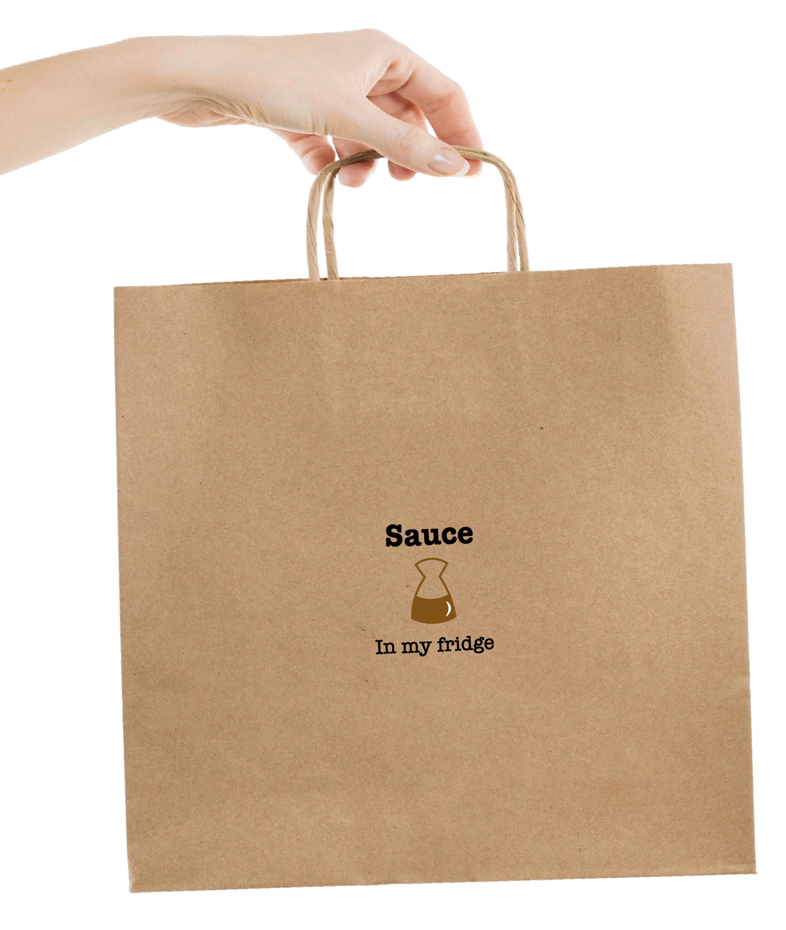
🧂🍜 Take away Bag Design 🍋🍮
Product packaging design.
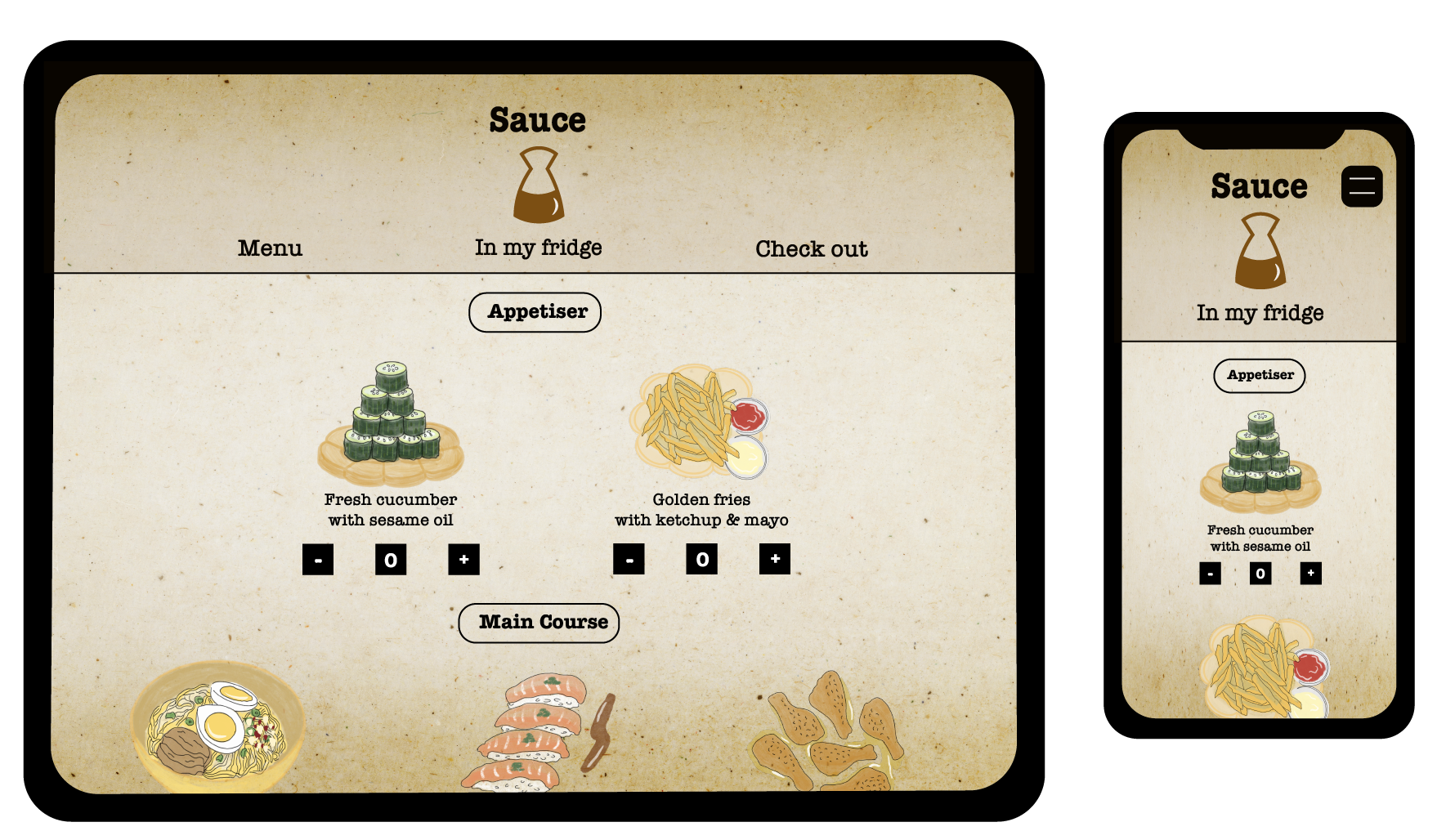
🧂🍜 Tablet theme Design 🍋🍮
When the customers wanted to order from the QR code on the tablet or phone.
🧂🍜 Final 🍋🍮
Overall design in one go, enjoy!
🧂🍜 Conclusion 🍋🍮
Through this design project, I learned how essential it is to extend the brand story into the brand’s visual identity and collateral. Maintaining consistency in color, design, and narrative plays a key role in shaping how customers perceive and connect with the brand.