🧋 Identity Design Project: Design packaging and branding that captures a narrative and creates an immersive experience.
🧋 Tools: Adobe Illustrator, Adobe Photoshop, After Effect, Procreate
🧋 This page showcases my brand design, typography expertise, and drink packaging design.
🧋 Initial Ideas 🧋
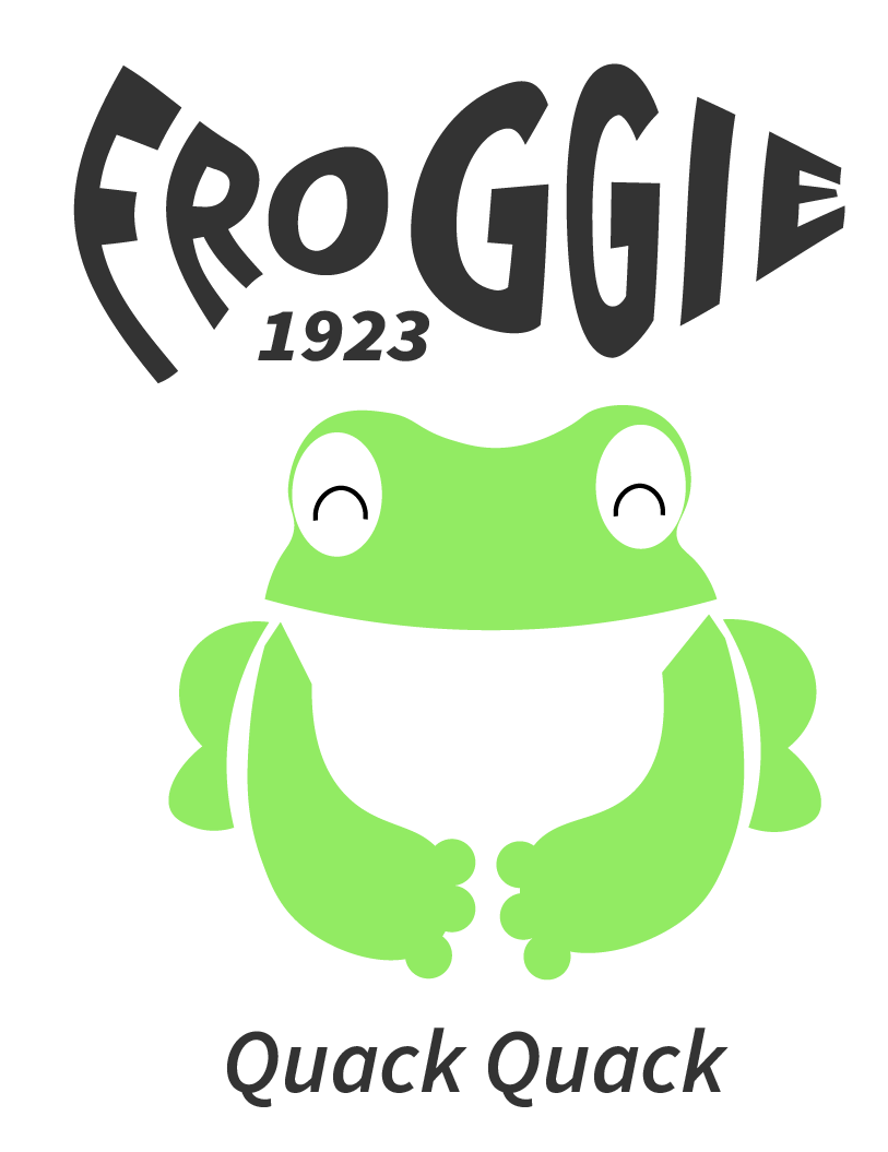
Thinking Process: I often see companies on LinkedIn looking for beverage packaging designers, so I decided to create a concept for an aluminum foil can design inspired by a brand story. Being from Taiwan, the first drink that came to mind was "Boba Tea." Although Boba tea is traditionally packaged in a plastic cup, I wanted to reimagine it in an aluminum foil can. To make it more distinctive, I thought about creating a boba tea drink featuring tapioca pearls. In Taiwan, we sometimes call tapioca pearls "frog eggs" because they resemble real frog eggs in appearance. That gave me the idea to design a logo featuring a frog.
🧋 Research 🧋
1. What skill do I need to have for drink packaging design?
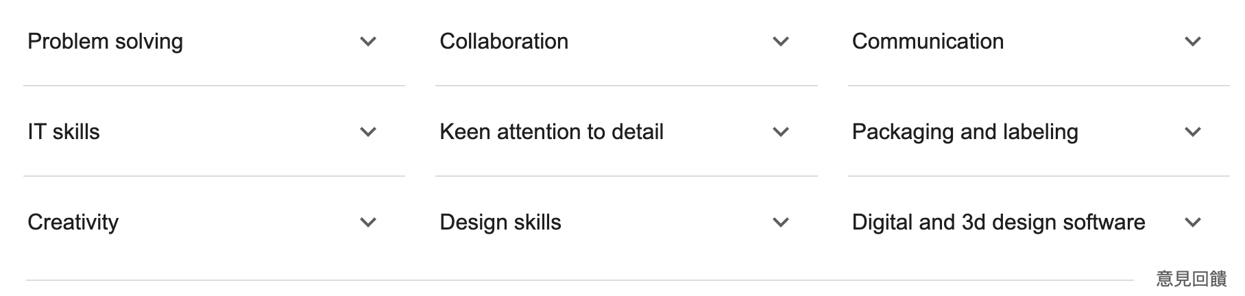
2. Interested in Illustration, Typography & making things look good enough to drink?
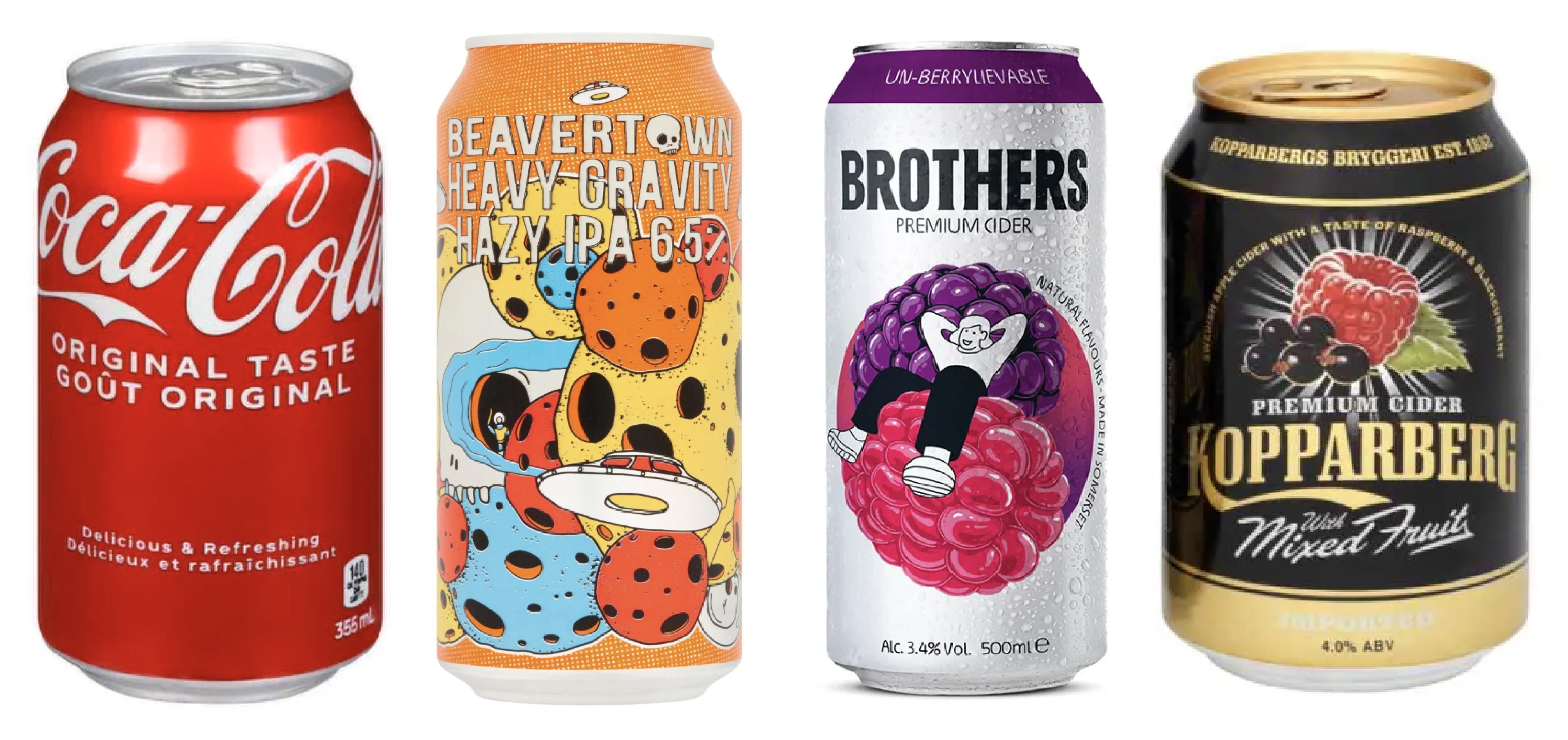
Source: Coco Cola, IPA, BROTHERS, KOPPARBERG
Reviewing a few examples, I find they all have similar points: Big typography, colourful can/image, little tiny description if needed
Analysis
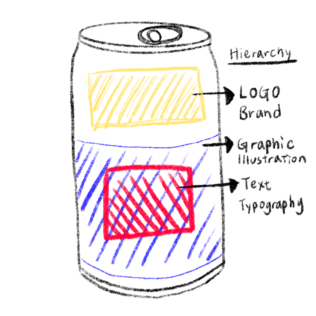
Packaging design involved creative concept development, label design, print specification preparation, and artwork production. This is the layout I want to put in my tin design.
Typically, before starting design, the marketing team conducts research to analyse consumer demographics such as age, gender, jobs, etc.
However, since this project is a personal creation without the support of a marketing team, I approached it from a designer’s perspective. I envision the frog character in a bright green color, paired with a funky, playful typeface. The lively typography is meant to capture the feeling of bubbles dancing on the tip of the tongue, bringing a sense of energy and fun. Since this is a summer drink, it's important to use light, refreshing colors throughout the design.
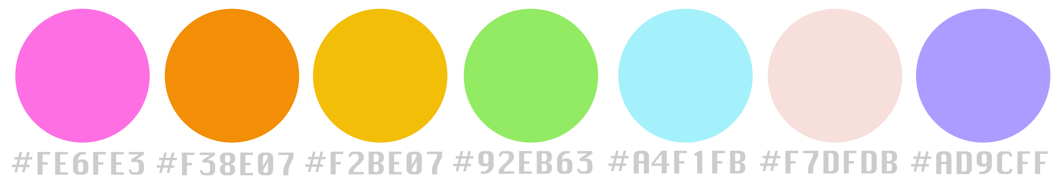
🧋 Colour Chosen 🧋
🧋 Logo Design 🧋
🧋 Theme Design 🧋
To create a lively and refreshing atmosphere that complements the frog logo and "tea soda" theme, I selected a light baby blue background. Additionally, the movement of the lotus symbolizes the dynamic effervescence of the bubbles in the drink!
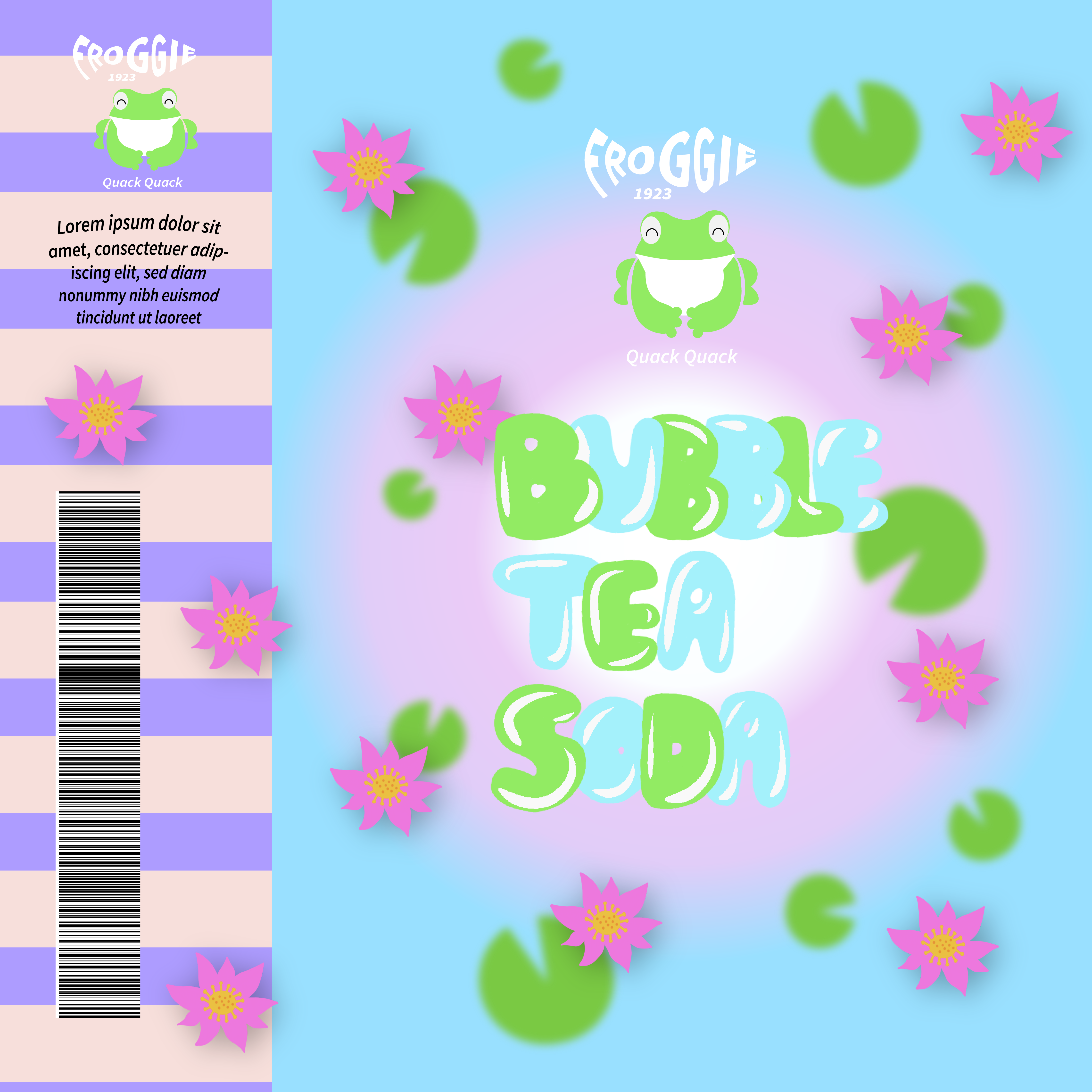
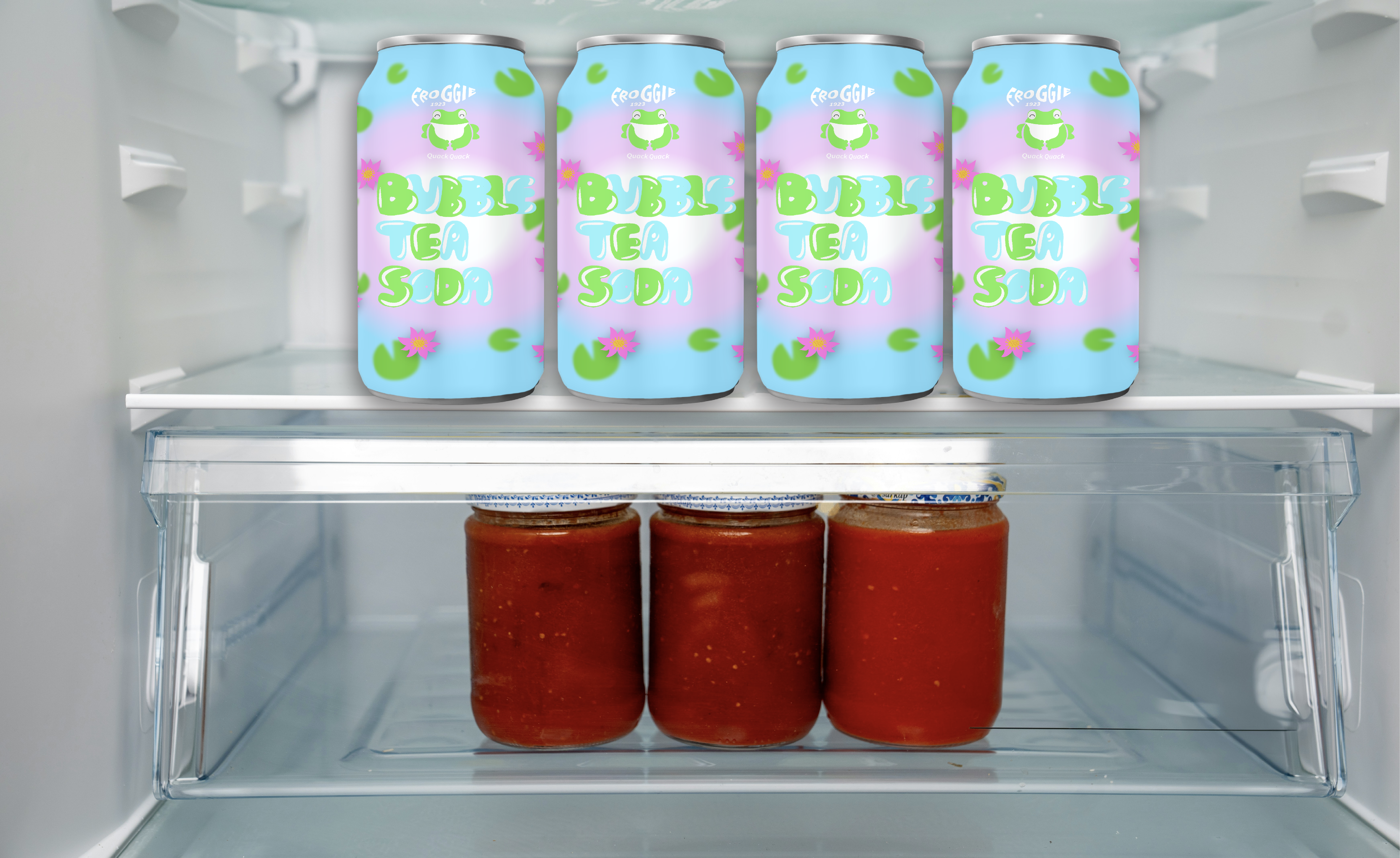
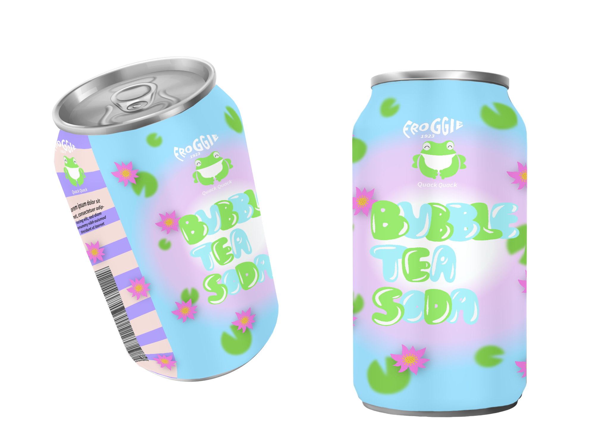
🧋 Drink Packaging Design 🧋
I used Adobe Illustrator and Photoshop to design and apply the theme onto the tin.
🧋 Brand Animation Design 🧋
My goal is always to communicate the visual story in a simple and easy-to-understand way."
🧋 Reflection 🧋
After working on this project, even though I don't yet have formal experience in beverage packaging design, I’m confident in my design execution skills. Of course, in a real workplace setting, it’s essential to collaborate with the marketing team, relying on their market research, consumer surveys, and analysis to guide the design process and accurately express the product’s story and image. I found this project incredibly interesting, and I hope to have more opportunities to be involved in commercial packaging design in the future.